Thank you Smith Lumen your magnificient creativity always delight us!
THANKS SMITH LUMEN
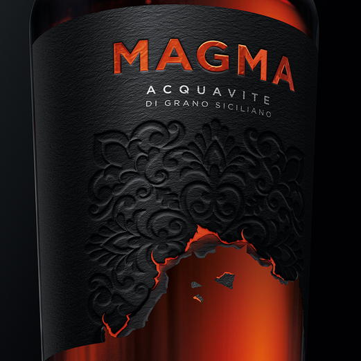
Smith Lumen’s design aims to communicate the soul of this unique producto. Few things inn the natual world are as dramatic and captiving as a lava Flow. In order to reproduce this sensation, the label is literraly consumed by a red-hot burn that express how the forces of nature influenc this producto, this land and its people.
The challenge was to capture this in a sophistyicated way and create a memorable identity for this unique, premium spirit.
The bottle selected was the Estal DA Clarior.
To express the complexity of the product, a thick, textured paper called Fasson Cotton by Kurz was utilized. In contrast with the dark background, the luminescence of the Brand and the burns are expresses by using a refletive organge foil.
The sculptural ebossing gives the right leve lof complexity to the visual storytellling while the bottle cap adds a final, precios touch.
This project was made possible by Estal, Avery Deninson and Leonhard Kurz, leaders in premium packaging innovation.
Discover the magnificient design of Smith Lumen for makeamark.world